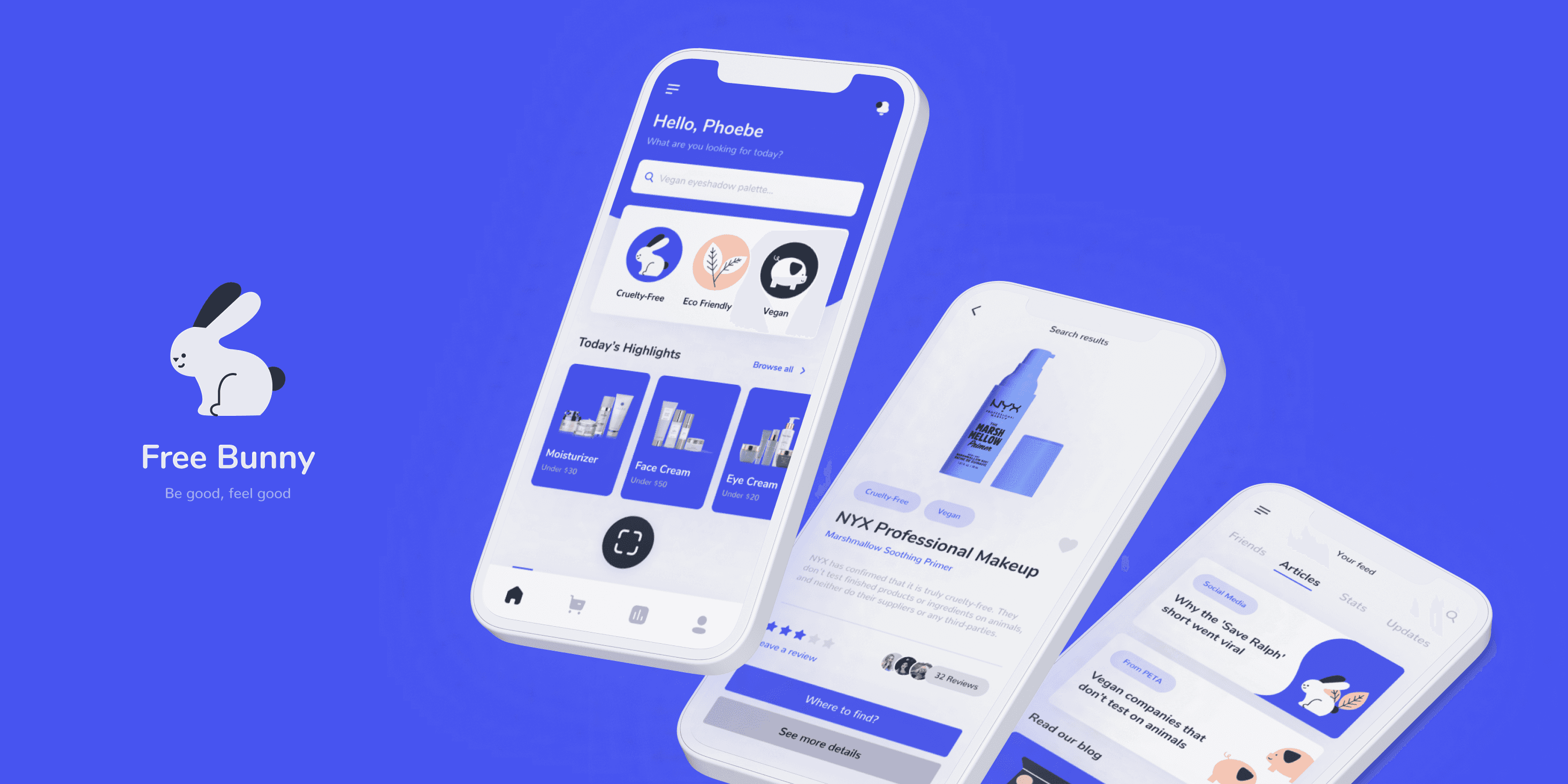
Free Bunny
Mobile App, Case Study
2021
Project Brief
Free Bunny is an app for people who seek to purchase cruelty-free products online and in stores. This is a case study that I conducted to explore the current methods, potential consumers and their needs, and propose a usable solution.
My Role
User research, wire-framing, prototype, iteration, and the creation of the final high-quality design screens.
Duration
July - August 2021

The Problem
Target users of the Free Bunny app face difficulty in finding and purchasing cruelty-free cosmetics and hygiene products, both in stores and online. They feel disappointed with the fact that it takes hours of research to find the products they need.
Goal
Design an app that is easy to use for all users and allows them to effortlessly search and purchase ethically created products, as well as discover and share cruelty-free brands with their friends.
User Experience
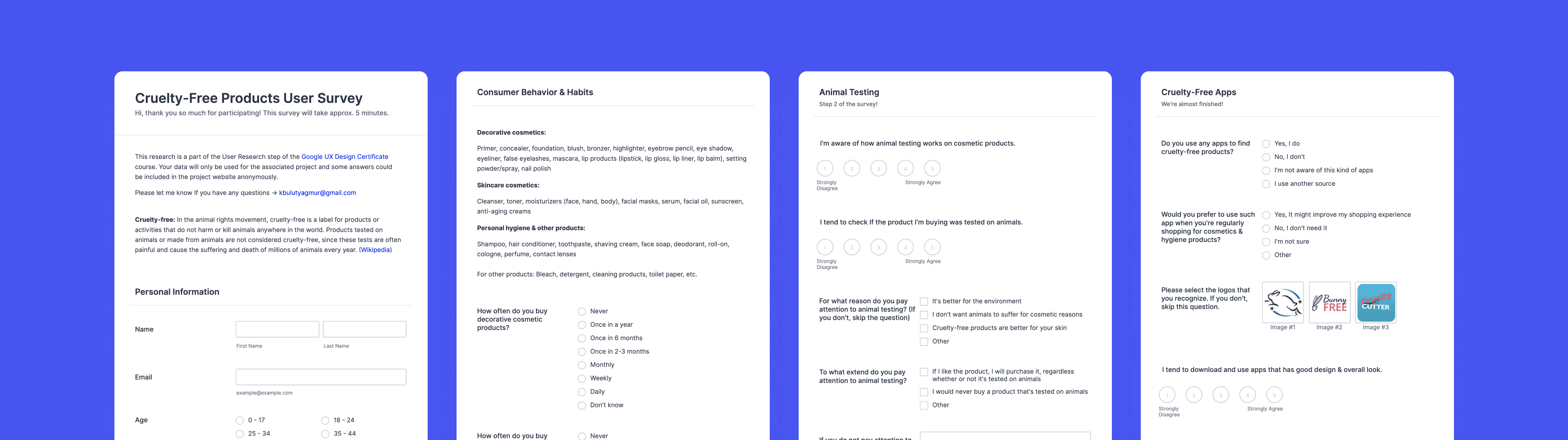
User Research
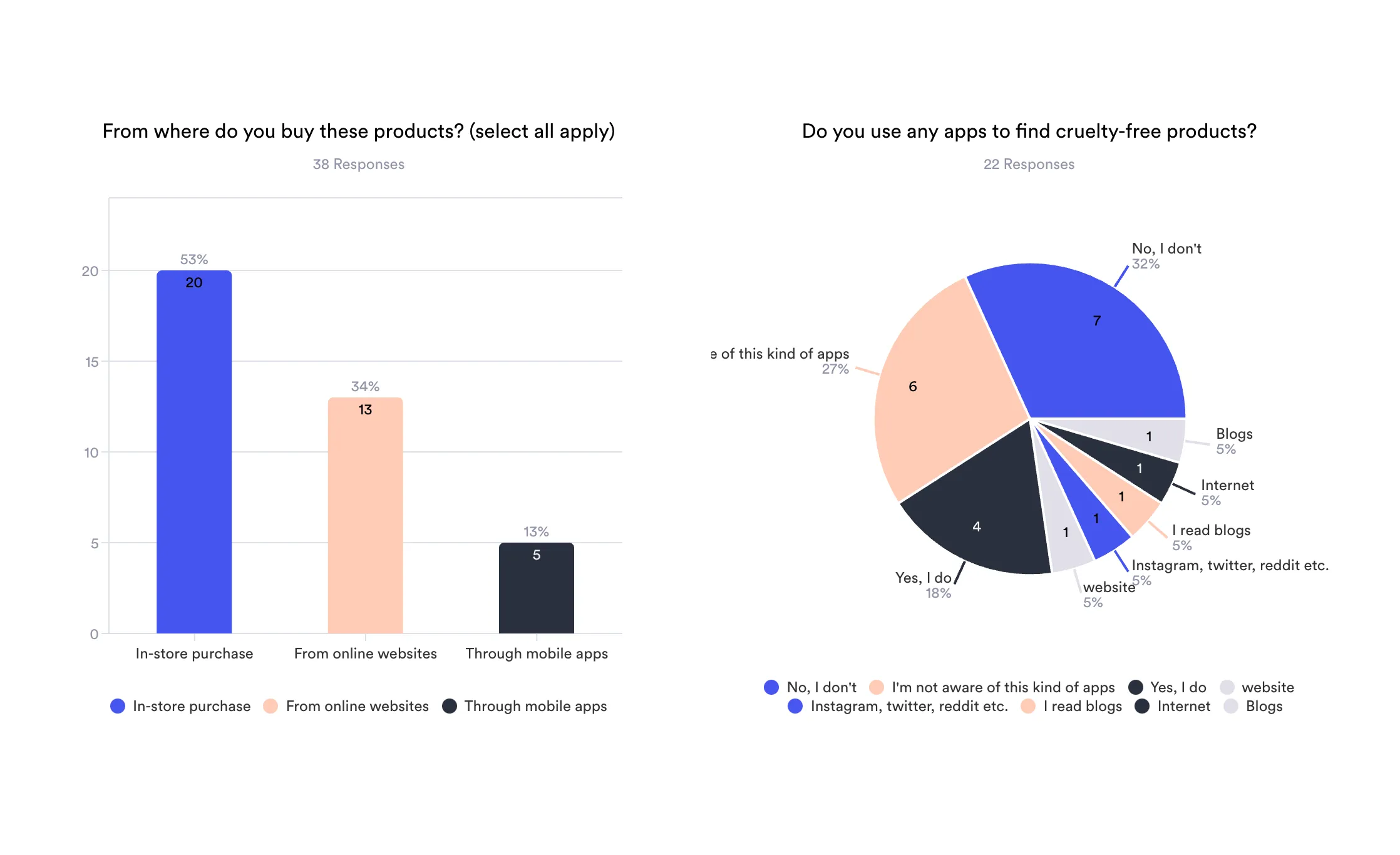
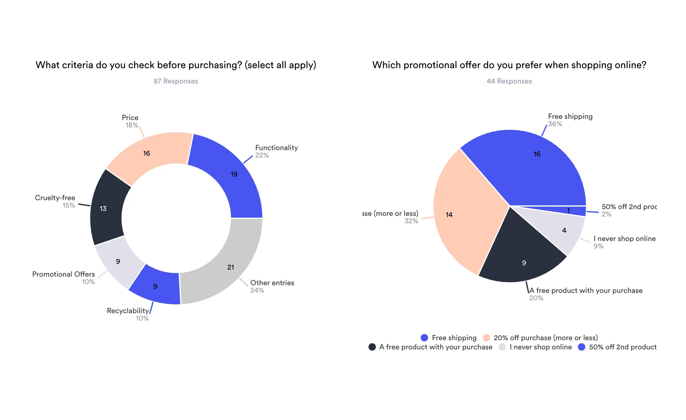
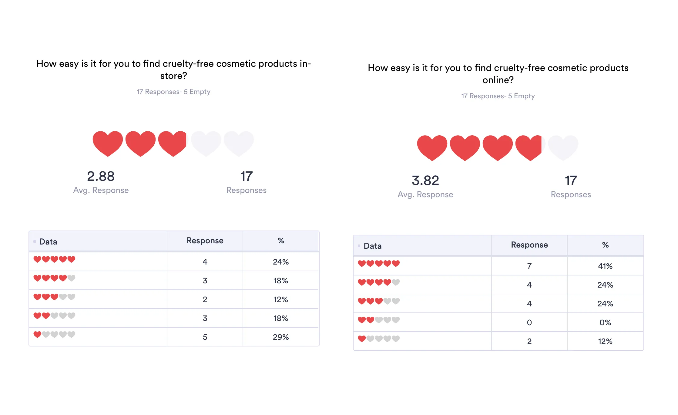
I conducted a short user survey to gather insights on preferences and challenges in finding cruelty-free cosmetic products. I shared with friends, family, colleagues and in local communities that m
Surveys allow direct feedback from users.
They help identify key criteria and pain points.
This method is quick, cost-effective, and provides measurable data for informed decisions.
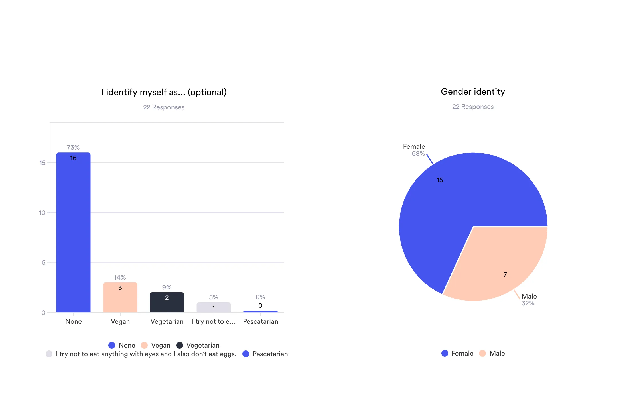
Based on survey responds, participants are mostly female, who don’t have any preferences when it comes to food consumption and their age average is between 18–24.
User Personas
I ran the user survey to get a clearer picture of who I was designing for. From the patterns in their feedback, I created two main personas—fictional, but based on real insights.
“I often have problems finding ethically-produced alternatives of cosmetics I’m already using.”
“ I wasn’t aware of the importance of animal testing among products that I use in my every day life. Now I’m trying to involve checking for cruelty-free badge to my shopping routine.”
“It should be easy to find ethical products with my phone, rather than searching for such brands in very long blogs or websites.”
These personas helped guide the design process and kept the focus on what really mattered to the users.

Persona #1
Selen Sonlu, Tattoo artist, 24
Background
Selen is a non-meat eater tattoo artist from Turkey. She has a big friend group who are also pursuing the vegetarian life, they often share each other cosmetics that are not tested on animals. She has 2 dogs and a cat.
Goals
Buy cosmetic products that are not tested on animals because she is an animal lover
Share product findings with her friend group
Keep her favourite products into one place
Frustrations / Pain Points
It’s hard for her to take picture of every product she finds and send it to her friends
Blogs and websites are not easy-to-use for her to find cruelty-free products
She’s spending so much time to find a cruelty-free product in a store
Needs
A built-in sharing feature or product feed to quickly update her friends
A well-organized, mobile-friendly product database or directory
A way to save or “favorite” products for future purchases
Quick scanning or lookup feature to check products on the go

Persona #2
Burak İltmez, Engineer, 26
Background
Burak is an engineer from Turkey, who doesn’t eat meat besides fish. He recently watched a short movie about cruelty-free life style is and he started to look for ethically made products to have less impact on animal testing.
Goals
Make more informed choices about the products he buys
Switch to cruelty-free alternatives without a lot of research hassle
Use a simple app that makes ethical shopping easy and accessible
Frustrations / Pain Points
It’s hard to learn what’s true or false about animal testing
He doesn’t know how to find cruelty-free alternatives for the products he’s been using
He thinks existing apps are not clear or not user-friendly
Needs
Clear, trustworthy information on which brands test on animals
Personalized or easy-to-browse suggestions for cruelty-free alternatives
A clean, user-friendly app interface that’s simple to navigate and doesn’t overwhelm
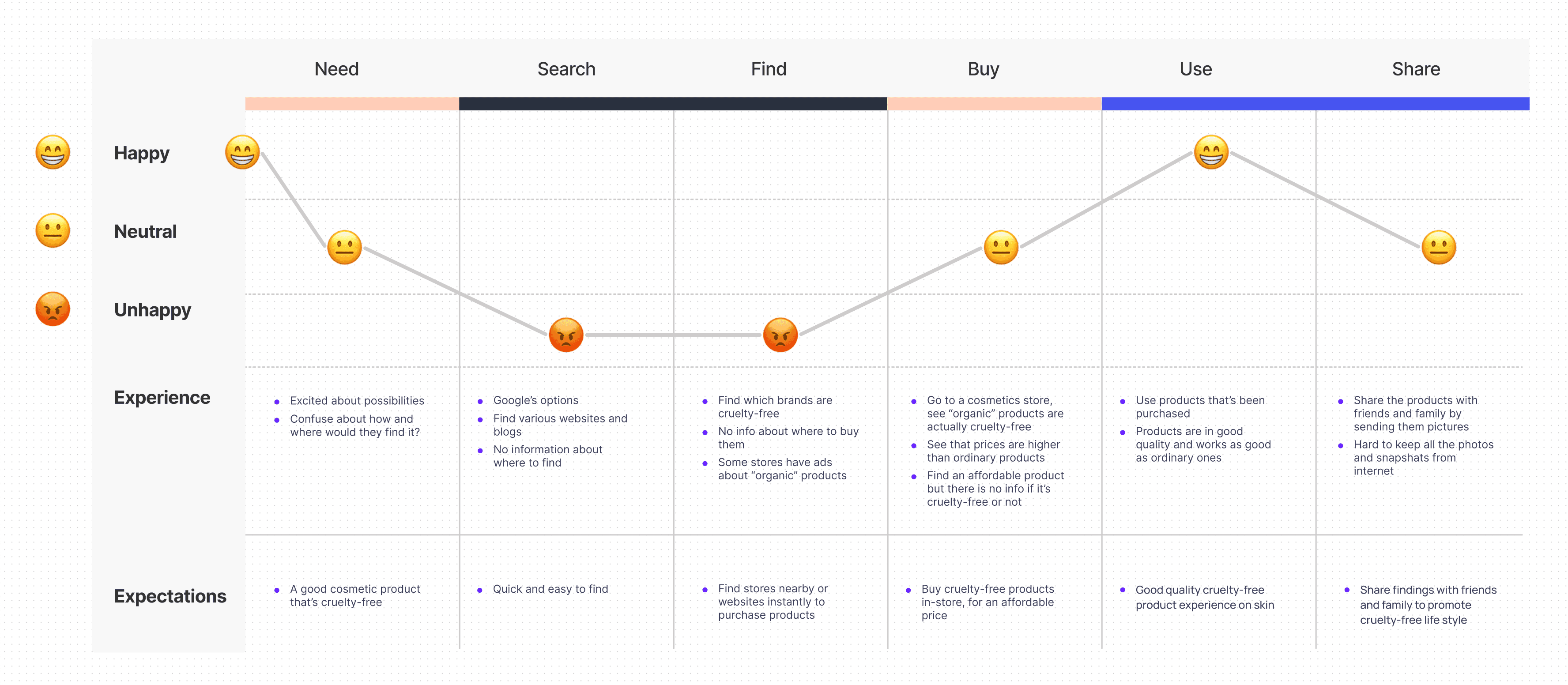
User Journey Map
The user journey map visualizes the emotional experience of users across six key stages: Need, Search, Find, Buy, Use, and Share. It combines emotional states (happy, neutral, unhappy) with insights into user experiences and expectations at each step.
Based on their journey, users begin their search for cruelty-free cosmetics with excitement, but quickly face frustration during the Search and Find stages. Despite many online resources, they struggle with confusing layouts, unclear product information, and difficulty locating places to buy.
At the Buy stage, users are unsure if products labeled “organic” are cruelty-free and find prices higher than expected. Experience improves during the Use stage, where product quality meets expectations. However, Sharing is limited due to the lack of easy tools to organize and share findings.
This highlights a need for a user-friendly, mobile-first solution that simplifies discovery, verification, and sharing of cruelty-free products.

User Flow Chart
I had a hazy concept of how the app would work after doing some research and describing user sentiments and experiences. This flowchart maps out the core navigation and interactions within the app.
Key features
Product discovery via categories, search, and QR scanning.
Detailed product pages with direct links to purchase or locate items on a map.
Social & informational elements, such as a feed with articles, stats, and friend profiles.
Store finder functionality that connects users to physical locations with directions.
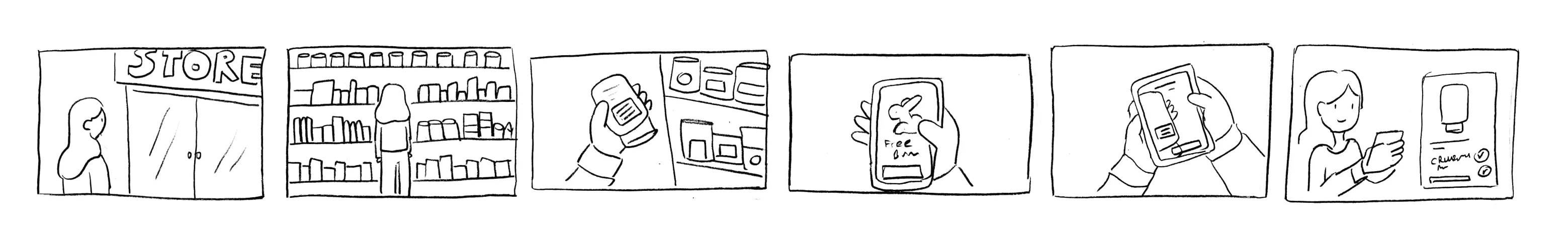
User Story
I made a storyboard to describe the user’s app experience. This is an excellent tool for imagining how the product will be utilized in a larger context. It’s a cost-effective and efficient way to capture, relate to, and explore the app in the real world.
A typical scenario for the user would be: Going to a store, looking through cosmetics, finding one and then scanning its QR code on the app–then finding out if they're cruelty-free or not! In case they're not, user sees recommendation of alternatives to that product.

Wireframes
The wireframes represent the basic structure of the app, serving as a visual guide for layout and functionality. They helped me organize interface elements effectively and focus on user flow rather than visual design.
By keeping the design simple and low-fidelity, I was able to test ideas quickly, iterate on features, and validate core interactions without being distracted by aesthetics.


Visual Identity

Color & Typography
Going with a well-contrasted color scheme and selecting purple as the primary color helped me shaping the app’s visual identity. The main intention was to give it a fresh, rich, and modern feeling.
Nunito is a free Google font designed by Vernon Adams. It’s a well-balanced sans serif typeface superfamily, and rounded edges add a little playfulness to the design.
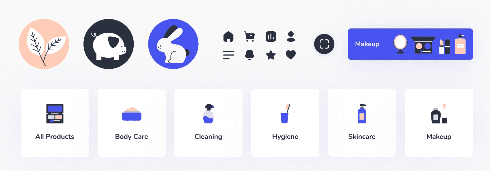
Icons & Illustrations
Icons and illustrations are a huge part of the visual identity since they convey ideas and notions that in some cases cannot be conveyed using words. For this app, they play a critical role to lead the users besides product and brand photographs.
I opted in for a friendly feeling with simplified vectors, and cartoon-like silhouettes for animals. The idea is to make user relaxed, and feel like they're doing something good.
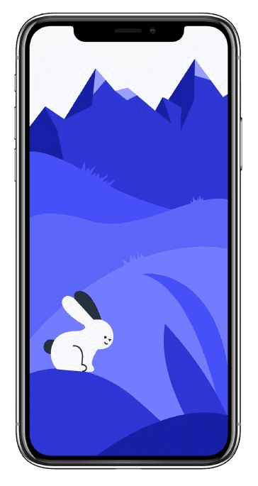

Name & Logo
The main reason to call it “Free Bunny” is a fun reference to PETA’s official app, “Bunny Free”. For the logo, I wanted it to be simple and easy to recognize, as well as giving it a warm feeling to the user by putting a smile on the bunny illustration.
Hi-Fidelity Mockups

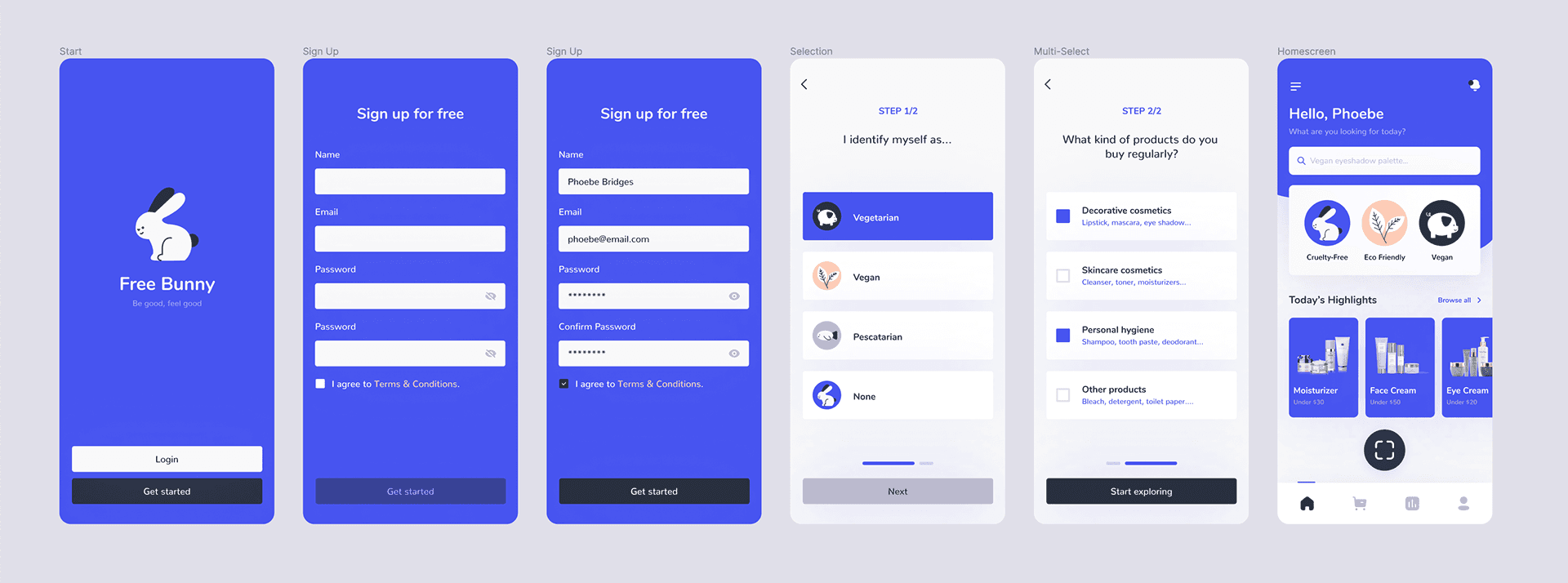
Onboarding Flow
The goal of onboarding flow in Free Bunny is to collect user information, that includes asking whether they follow a vegetarian lifestyle, and what kind of products they purchase regularly.


Scanning Barcodes
This element is the heart of the app. After onboarding, users are able to see a “scan code” indicator, which opens the phone’s camera and leads them to scan the barcode of a product. The next step is to see the product page with details, read reviews of it, and see where to find it.


Notifications
I chose to provide consumers with notifications of discounts, special offers, and the actions of their friends for added convenience. The major goal is to keep users engaged with the app and to keep them informed about opportunities that may be of interest to them.

Product Categories
The rest of the app includes product pages, a comprehensive list of brands that create cruelty-free and/or vegan goods, friends feed, related articles, general statistics on the user’s consumption habits, and a simple profile settings page.

Thank you for reading this case study!
You can find this published on Bootcamp, and feel free to Download the "Free Bunny UI Kit" from Figma Community!
Tools used:
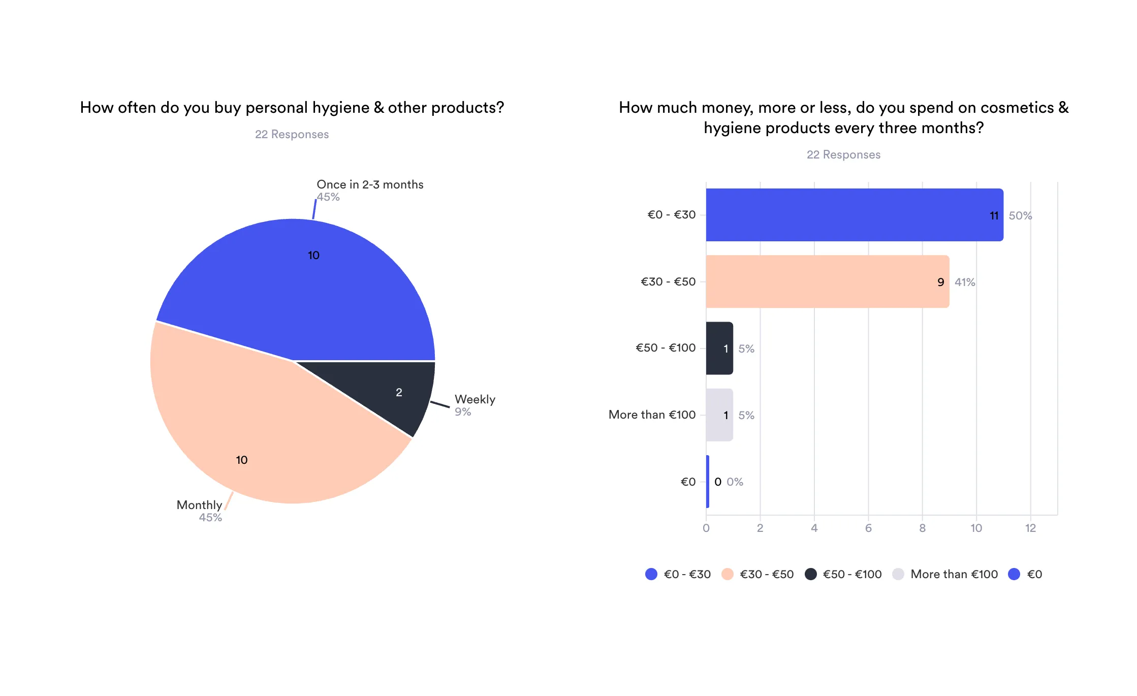
Jotform: User survey, research, data visualization
- Figma: User interface design, other design assets, GIF, Figma community for device mockups and iOS UI kits
- Figjam: User journey map, user flowchart, wireframing
- CamScanner: Scanning sketches and storyboard